BARK MOBILE APP
An end-to-end market research and survey app for Good Run Research & Recreation.
Graphic Design
Visual Identity Design
Prototyping
UI/UX Design
Creative Direction
Challenge
✻
Current consumer survey apps often don’t offer an engaging or enjoyable user experience. Whether it is through only making a few cents per survey or rarely qualifying for surveys—this can cause a lack of interest or consistency among respondents, ultimately leading to abandoning the app or just racing through questions. This creates the potential for unreliable consumer data for fielding research. Good Run Research & Recreation (GRRR) is interested in bringing its motto, “Anything but ordinary research,” to the consumer through a survey app that feels rewarding and enjoyable to complete, keeps a consistent user base, rewards them for their time equitably, and collects reliable high-quality user response data.
Creating surveys also poses a challenge to companies fielding research. Either the tools are not intuitive or are limited in their customization capabilities. Limited time or respondent base also becomes a limitation to collecting market research data. GRRR is interested in revolutionizing the tools of market research to match the needs of every client for every project.
✻
Project Goals
Create a mobile app, web app, and website that improves the market research process for both respondents and clients, as well as a brand identity. The mobile app and website are featured in this first phase.

01 - Exploration
Overview
✻
To better understand the parameters of client frustrations a comparative analysis and interviews both internally and with clients were conducted. The goals for this research process were to explore and define:
The pain points of current survey platforms and market research tools for participants and clients.
The areas of optimization for visual appearance.
Interviews
✻
Internal and external interviews were conducted with individuals who use online market research platforms and survey apps. They were asked about their likes and dislikes of the UI, how it detracted from or enhanced their interactions with the app/platform, what processes they felt could be streamlined, what features they would like to see, and which could be eliminated. The following is a summary of their responses:
Clients:
Survey Customization and Templates
Having the ability to fully customize the survey to answer whatever questions might be included in their research project was one of the top desires amongst clients. Part of the customization desires is having a large library of survey question types that feel like an all-encompassing tool kit. For each of these template questions, they would be able to completely customize the visual appearance ( color, button type, font, etc. ) to match their branding or style requirements. The question options available would range from simple short text responses and button selections to animated mood sliders and package heat mapping. Clients wanted a survey creation platform that could be as easy as drag and drop. While some clients wanted full control of customization, others, who mainly perform flash-qual research, wanted a vast library of pre-built templates. These pre-built templates ranging from simple to complex flows, would ideally only need to have the text swapped out, logo added, and colors changed.
Sharing, Saving, and Listing Surveys
Every client needs to send out the survey once it is completed, but having functionality beyond batch-sending surveys was desired among all clients. Clients desired the ability to save surveys without publishing them, save a survey as a template that would be added to the template library, and toggle the survey’s status between, ‘active’ and ‘closed.’ When sending out surveys they wanted full integration of project email lists so there would no longer be a need to copy-paste CSV files or email lists when sending out the survey—it could all be done when creating the project in the system. They also wanted the functionality to create subgroups of target audiences’ emails for projects for additional rounds of focused research. Most clients wanted to see the same email customization as current applications but wanted the visuals of the email to have the same visual identity ( colors, logo, etc.) as the survey that they are sending out so it creates a cohesive experience for the respondent and invokes legitimacy.
Survey and Project Management
Unanimously across all clients that were interviewed the desire to have a one-stop shop hub for survey creation, distribution, and research project management was vocalized. This portal would allow clients to connect their database of respondents, manage project timelines and materials, track individuals assigned to each project, manage project files and surveys, analyze data from each project, and export it to Excel and CSV files.
Respondents:
Ease of Accessibility - a.k.a. Don’t Make Me Jump Through Hoops
Annoyed with current survey applications, respondents wanted an easy sign-up and user experience from day one. They also wanted to feel confident and comfortable using that app ensuring that they weren’t being scammed or phished for personal information. They wanted the app to be easy to navigate and have the opportunity to reach out to someone for support if they ran into any issues or had any questions.
Compensation That Feels Tangible
Respondents wanted to be more fairly compensated for their time. Many mentioned the sting of spending 30 minutes to an hour filling out a survey only to be stung with a compensation of a few cents. They also voiced the desire to have more interesting and frequent surveys and transparency around why they didn’t qualify for a survey. Their ideal survey app would feel like playing a game, where it was an enjoyable experience that they also were compensated for. Respondents also felt hesitant entering any financial information such as Paypal or bank account numbers to be paid, they wanted something straightforward and hassle-free.
Transparency
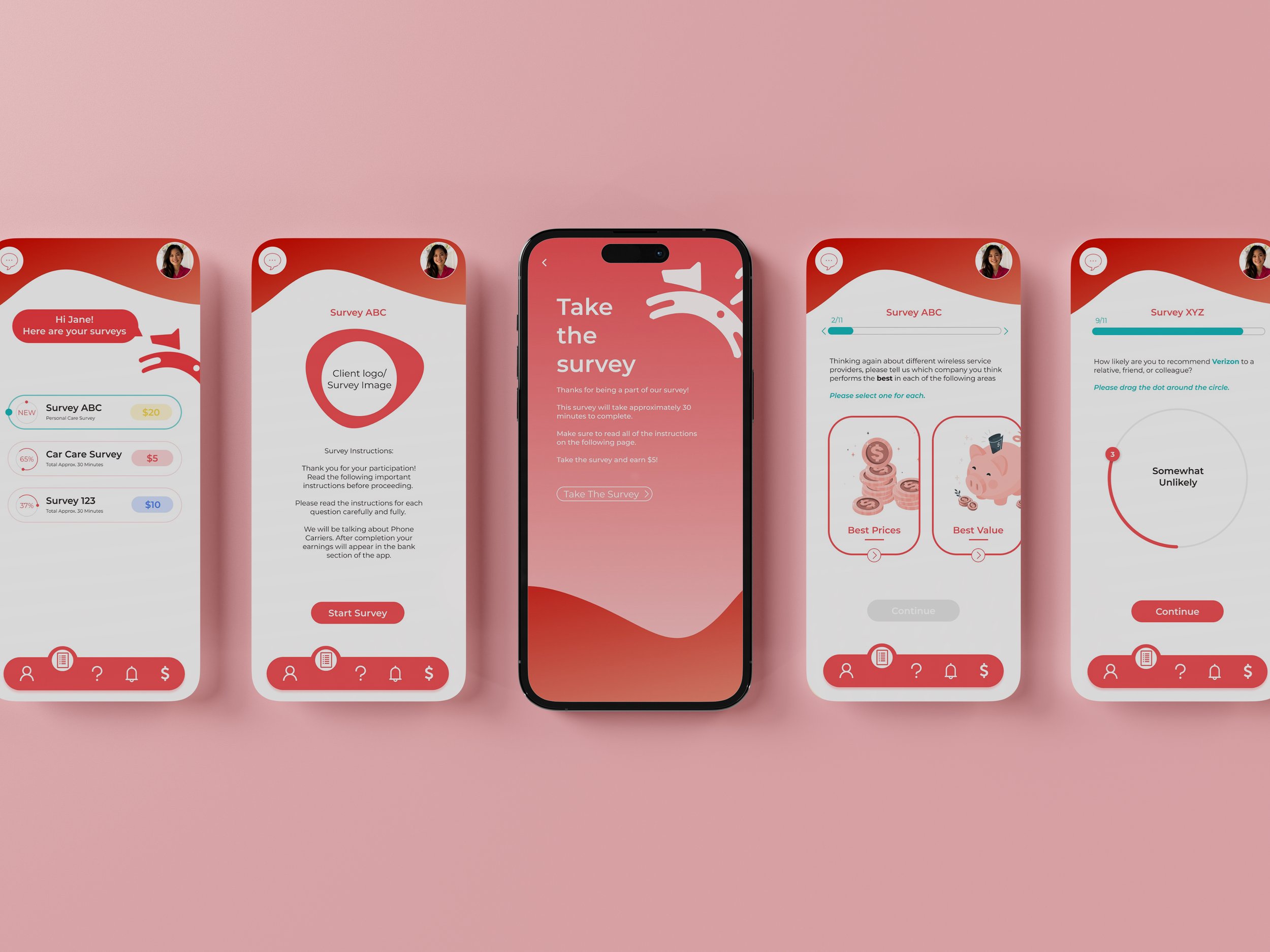
Respondents across the board desired transparency. Before starting a survey they wanted to see the time requirements and compensation amount, and when filling out a survey they wanted a progress bar. Because life is unpredictable they also voiced that have the opportunity to stop a survey halfway through and finish the survey at a later time without having to start over. Respondents also vocalized the desire for transparency in the company. They wanted to have the ability to look into the company hosting the survey app ( Good Run Research & Recreation) to do their own research on legitimacy. They wanted statements and privacy policies that stated if and how their information was being used. They also wanted to see real people behind the survey app and business, since many vocalized the frustration in dealing with faceless third-party companies.
02 - Ideate
Overview
✻
Through multiple brainstorming sessions and collaborative meetings, the rough visual layout and organization of the respondent portal and client portal were formed. This was accomplished by creating outlines, collecting and organizing survey question types, developing user flows, and sketching out visual layouts.
03 - Prototype
Overview
✻
During this process, low-fidelity wireframes of the respondent app were created. I looked at several survey apps to gauge how they handled their general flow and how it compared to the desired implementation. Most felt cumbersome to submit answers or made it confusing what to do next. I researched the variety of question types that were featured and outliers to incorporate into the question options that the app would have. From there, a basic wireframe flow was created showing the experience of a user going through the app login and survey completion process.
Branding / Visual Identity
✻
Good Run Research & Recreation wanted the app and web app to feel connected to their branding, but distinct. They wanted the playful energy of their brand to shine, while still feeling professional and legitimate. This meant continuing their brand colors and use of dog imagery, but changing layouts and shapes to have more of an organic feel. Both the mobile app and the website utilize soft wave shapes with rounded edges in tandem with subtle gradients, creating a bold yet playful experience. Both the app and the website primarily utilize GRRR’s red however, to create contrast and distinction alongside such a robust color the brand colors of teal and yellow were also used to denote new information for the user.
04 - Product Design
Mobile App
✻
Website
✻
Web App & Admin Portal
✻
Coming Soon


