CU @ THE COOLER
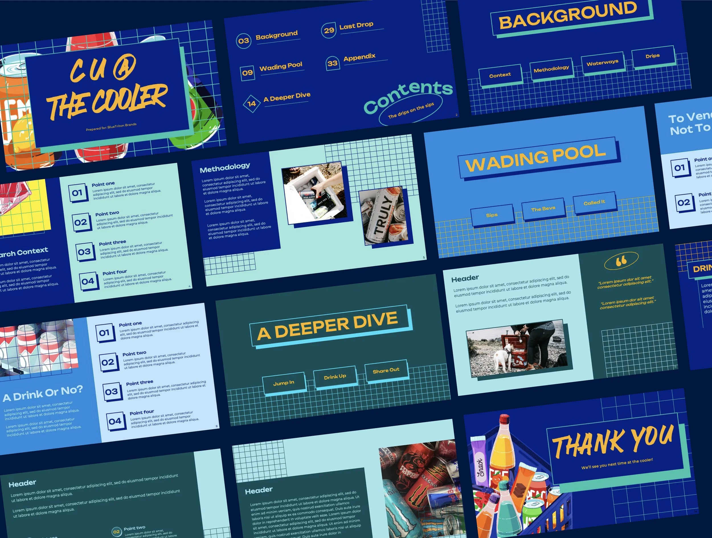
Deep blues meet casual drink cues as we dive into the cooler to see what looks (and tastes) good in markets around the country. This presentation needed to feel like those midnight or pre-party runs to the mini-mart or 7/11 for your favorite drinks and snacks—bold, playful, and snappy. High-contrast colors and a dynamic layout invoke the energy of those late-night runs to the corner with your friends. Ah, there it is, that nostalgic feeling.
✻ All information has been replaced with filler text or lorem ipsum to protect the confidentiality of the research.
Presentation Design
Graphic Design
✻
Design Strategy
Like tea with a lemon twist, this report needed to appeal to brand colors and familiar sensibilities while adding a new and zingy twist.
Graphic elements inspired by hand baskets for quick convenience store runs blend with Blue Triton Brand blues, creating a unique visual combination ideal for evoking the image of grabbing drinks for a party or on the way to the beach.


