GEN Z
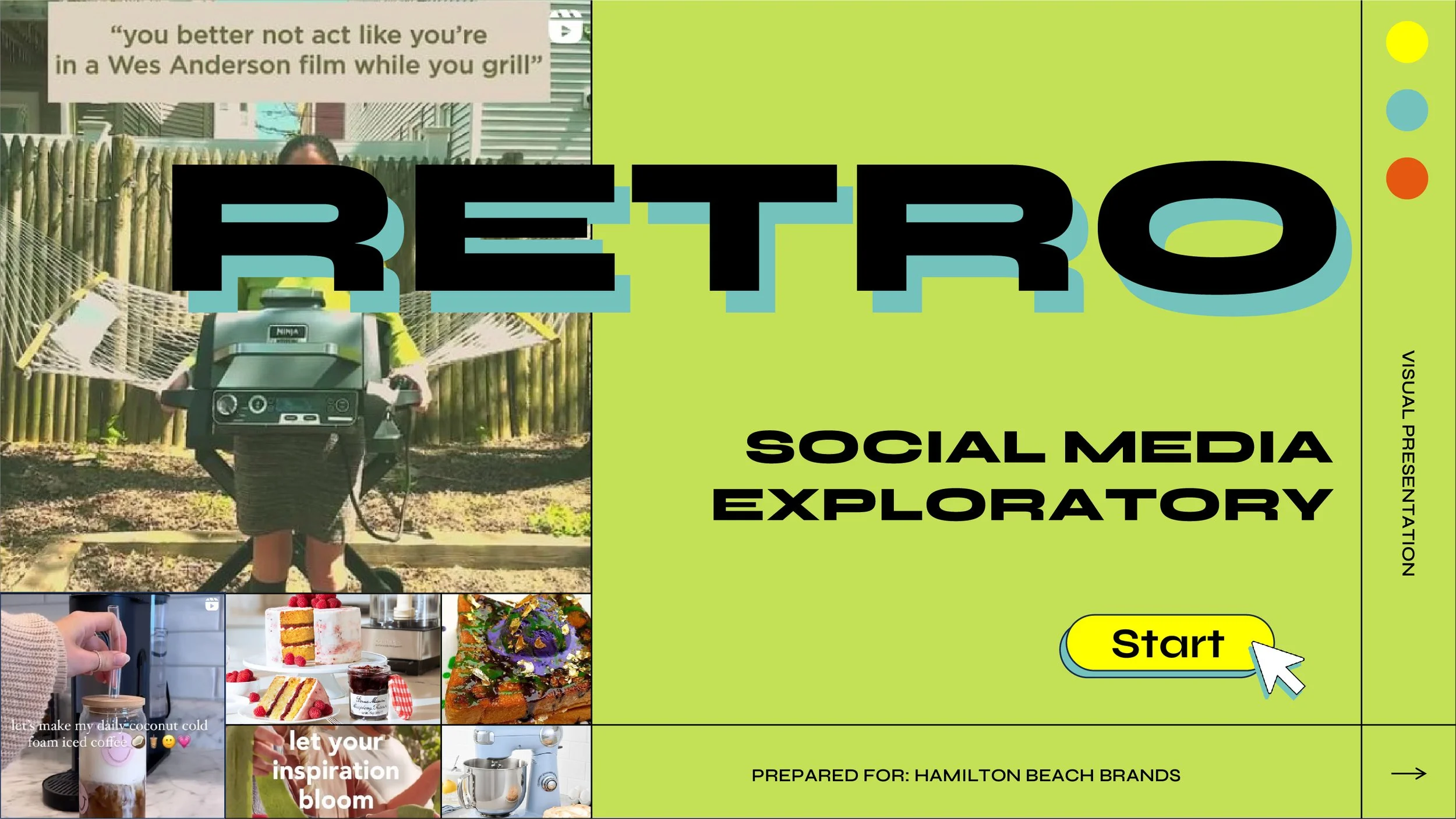
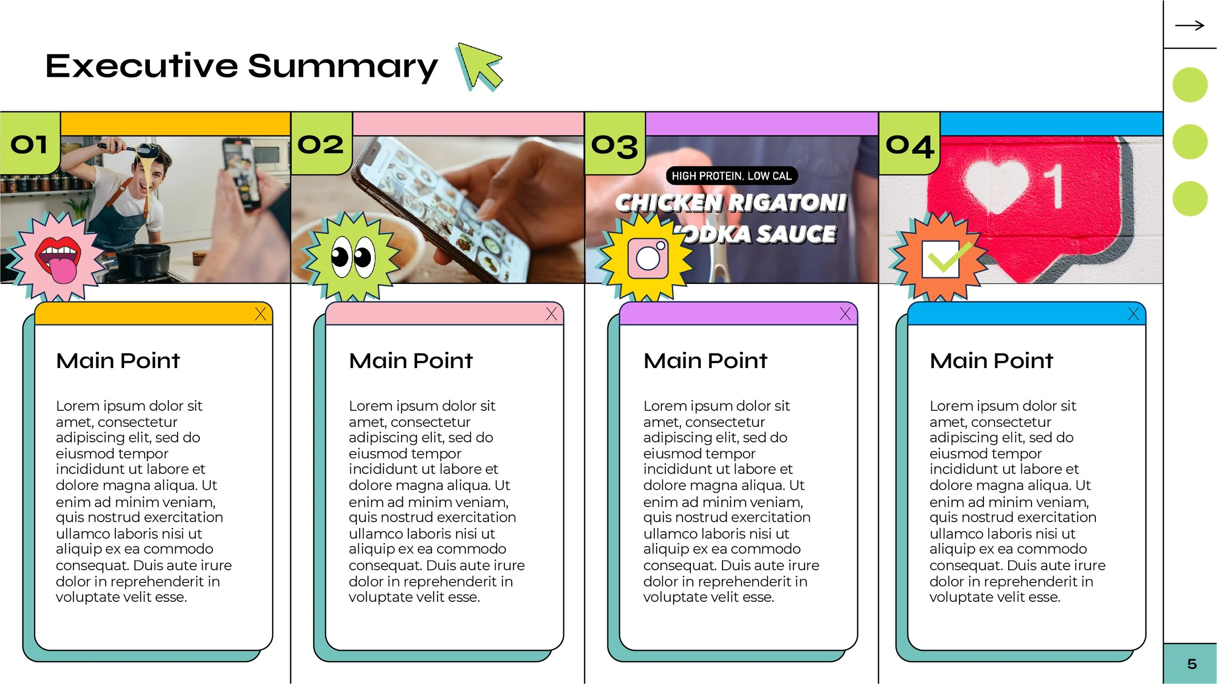
Qualitative research meets retro web UI, asking Gen Z the big questions in this dynamic deck. Embodying Gen Z’s voice, style, and references was key to bringing the consumer category to life so the client could intensely dive into how Gen Z sees and interacts with the world around them and the concept product. Brat green, memes, slang, and a casual design immerse the client from the get-go, making sure the qualitative data shines and the vibe hits different.
✻ All information has been replaced with filler text or lorem ipsum to protect the confidentiality of the research.
Graphic Design
Presentation Design
Design Strategy
✻
Bold colors, graphic elements, and images set the tone for this deck: Youthful and vibrant without giving off, “Hello fellow kids!” vibes.
Using slang, and style to embody the energy and references of Gen Z synergistically complemented the research, paving the way for understanding not only the findings but an easy-to-digest lesson on a new consumer generation.
Different But Approachable
✻
While the focus was on Gen Z the client is not part of that generational club. So, keeping the design straightforward and easily digestible while still retaining pops of vibrancy, was key. Giving a visual taste of what Gen Z is about and communicating the intent of the research isn’t mutually exclusive.
Decoding With Design
✻
Ensuring that the client wasn’t left alone to parse the new language which is Gen Z slang, decoder callouts were featured at the beginning of each section. This set the tone for each section’s topic and gave insight into how Gen Z views their world through the culture of slang and how the client could utilize it when promoting their product or interacting with this young, but powerful, consumer group.


